
In the dark and distant past I was prompted to write a suitably festive Christmas article. I’m not a big fan of Christmas to be honest, I think in fundraising it’s easy to get jaded when you start talking about the festive season in July. However, there are other more practical reasons to be a bit wary of the Christmas effect. It’s so easy to get a skewed view of support when you introduce seasonal responses into comparisons – how many supporters will only send you a tenner because they are jacked up on festive goodwill? How does this artificially inflate response rates and average gift values?
I’ll leave it to you to decide if my key points still relevant
I often get asked to look at campaign reviews and results. More often than I’d like, I see conclusions based on scant evidence. I also find the comparison of apples and oranges quite common.
Now, I’m not a purist. I don’t put much stock in statistical significance (not for the type of reviewing I do). I find the application of common sense much more useful in these situations. But comparing two campaigns that are totally different, come on. Really?
The avoidance of comparing toffee apples and Christingle oranges is what last year’s article warned against. And yes the key points are still very relevant. Comparing Christmas against anything is an exercise in futility. Yet I see it all the time. Even comparing Christmas with Christmas is pointless.
Trying to relate this year’s sales or donations against last year’s is meaningless. All it will tell you is that one figure is here, and one figure is there. Inevitably, the retail PR spin-train will endeavour to put the fluctuation into context of why “this year being up (or down) against last year”, but don’t fall for it.
Look at the chart below. It has the sales figures for 2016 and 2015. 2016 is less than 2015.
Oh dear, we are doomed
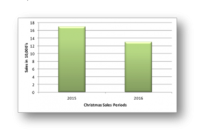
But let’s see what this looks like against the previous five years
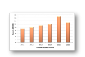
Adding in extra values and expanding the series it all that is needed to provide some context and get a much clearer view of performance.
You can see that 2016 is a clear increase on previous years, displaying a continuation of an upward trend in sales values. 2015 was an outlier – a response to a complex set of variables during that specific period, a set of variables that we can neither fully identify or replicate.
There are two valuable lessons to be learnt here
The first, and most obvious, is that you should never compare just two figures or outputs. Invariably it will paint an incorrect picture. All data, stats, facts and figures need context, and this comes from widening out the view and setting your information within a broader landscape.
My second point is more subtle. Think of Christmas like Las Vegas: What happens in Christmas, stays in Christmas. This is really important.
While I encourage you to set your data into its landscape to provide context, you need to ensure the landscape is the correct one. By this I mean the figures that you are trying to evaluate need to be compared to, and given context from, similar data.
You wouldn’t dream of comparing the sales data of breakfast cereals with sales data of Mercedes Benz, likewise, don’t compare Christmas with Easter or Summer, all of which represent specific times of the year each with its own unique outlook and reasons for giving.
I fear many a sales or fundraising strategy has been built one or both of these fundamental mistakes. Inevitably the strategy will fail and so more data is pulled together and presented back which will include the same mistakes which will compound the issue and cause the problem to snowball out of control… and… back to Christmas for me – but if you want to find out more – call us or pop over to this page.